expr:class='"loading" + data:blog.mobileClass'>

Saturday, April 30, 2016

Front Porch Light Fixtures

Front Porch Makeover, Part 2

As soon as the new rough cedar posts were up and bringing the house out of the 1960's, those darn posts quickly pointed out how bad the rest of the front of the house looked.  
I think how terrible the rest of the outside looked is what Bill kept saying. "Look how awful the lights look; look at how terrible the door looks..." FYI, for Bill to notice this stuff that much meant it must have looked really really bad.  He doesn't always pay close attention to details (or any attention to details, actually, haha!).  Okay, okay, I shouldn't tease my husband handyman so much, especially because I want him to keep helping me around here ;) - he's a keeper!

You've been warned - once you start updating just part of something in or outside a house, it's hard not to want to change the rest.  Not all big changes are costly (my favorite ones aren't, that's for sure), and most the time we can't do everything all at once, BUT there are small and fairly inexpensive things that can really have big impact, like NEW LIGHTS!!!

So next on the front porch list is the light fixtures, then the door, entry, shutters, porch furniture, etc.; but for today, light fixtures.

Bill couldn't get over these beauties eye sores.  They had to go.  IN.THE.TRASH.
Porch sconces BEFORE -
And just in case you wanted to see it up close -
They were pretty rough - 

So I went for the least expensive lights I could find while still fitting in with the style I was going for - 
this brand is from Menards and ON SALE.  
Kind of farm-housey, kind of nautical, kind of cheap.  
Of course I liked some that were $10-$150 more expensive, but I think they still make an impact while staying on budget for now. 


You see, I shouldn't tease my handyman electrician too much, he's at work again for me... 
although he doesn't have the EASIEST time with lights (think oil and water; Bill = oil, light fixtures = water.  He admitingly struggles with putting lights up but thank goodness he still does it!).  
Oh no, I teased him again!  
Teasing is my love language. 
I can't help it - but he's cute nonetheless-

And the lights are pretty cute too - 


*It's safe to say I like to go overboard with pictures; but then there are times I don't take enough or any at all.  Not much in between. 
This is not one of those times.  
Much better IMO!

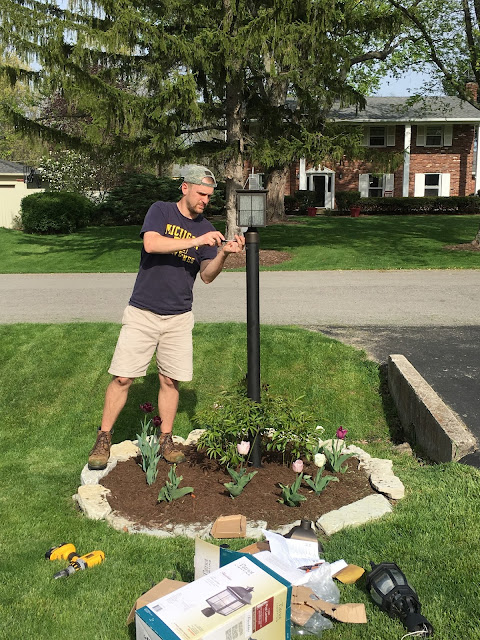
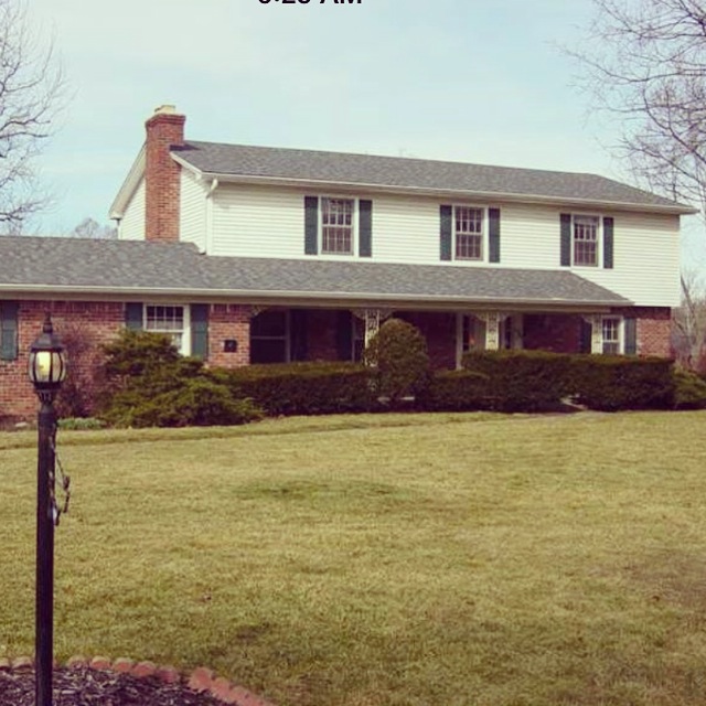
We also have a lamp post out by the driveway that needed sprucing up.  
Our old one wasn't THAT terrible like the sconces were, but it didn't sit on the pole all the way and the pole itself had a good lean to it.
 Even adjusting the lamp post and positioning the light on straight would have helped tremendously, but I'm glad we switched out the light at the end of the day. 

Here's what it looked like before -
Hello dark purple tulips.  See you in a couple weeks peonies.

I was able to find a lamp post light ($8 off right now at Menards) that was a similar style to the sconces for half off through a swap page I'm on, so I was pretty excited!  
At $23, I would make it work!

Glad I've got that electrician...

Who straightened the post out too! 


And the end result looks a lot better, especially in the stone bed Bill made surrounding it (told you he was a keeper).  
Just some light sanding, black spray paint, straightening the post and switching the light made for a much cooler lamp post! 

We are doing a few more things to spruce up the porch.
Don't those cedar posts look a lot better than the old metal ones?!  
And our plants are coming up in mulched beds! 
Woo woo for spring - 


Hope you're weekend is filled with fun outdoor projects too!
We'll be under the porch staying out of all this rain!  

Thursday, April 28, 2016

Updating Our Front Porch with 6"x6" Rough Cedar Posts

Front Porch Makeover, Part 1:

Spring has sprung in Indy and what better way to enjoy it by sitting on the front porch looking at the tulips and kids playing/crawling in the grass, right?

Well, that is unless you have old metal grape vine posts obstructing your view!!!

As soon as March hit, we couldn't stop talking about when we were going to update replace our front porch posts.

I have to admit that they were SO BAD that I had to block them out of my mind every time I pulled up to the house.  It was like I trained my eyes to skim over them and look past them every time I drove up.

And then I kind of forgot how bad they were, until I put the pictures up here on the blog....
I mean they weren't that bad were they?!  YIKES...


Okay, so you probably get the idea now!!!

I mean I can't even defend the 60's charm (if there is such a thing), and maybe 1963 was a big year for metal grape vine posts - our neighbors' look fine painted black, so maybe just not the chipped white paint over rusted metal look is the best...  I don't know; trying to throw the old girls some bones here...

But you know how some projects just need a small change for big impact?  That was this project.

It technically was a lot of work (not for me I have to add, other than making decisions heehee), but considering it was ONE Saturday, for 5 hours, not including Dad's trip to the lumber yard for the cedar posts and metal bases, and help from a brother who knows what he's doing... and viola, the front of the house looks 1,000x better.

We first narrowed down the replacements to two options -

The standard white colonial posts, typical of what you'd see in our neighborhood, at a thicker 6"x6" -


Or 8 ft. long 6"x6" rough cedar posts and then Bill would build a little trim for the bottom of each -


I thought the cedar posts would be be different enough but work okay because we have barn wood columns inside and it wouldn't look too off to use wood on the outside as well... so that's what we went with - and my dad so graciously picked them up the day before.

Now here's a glimpse of the guys getting their 5 hours clocked in two weeks ago -

The vinyl that was wrapping the main support beam underneath the roof had to come down to remove those grapevine posts- 


Trip barked orders at uncle Andy when they first started; and then pounded against the glass door for a good 15 minutes - 

The beams were 8 ft. long and had to be trimmed down.  The bottoms had to be chiseled out to put the metal bases on -

Earlier in the day, we thought that the front side of the cross beam's vinyl would have to all come down to get the posts out and then the new ones up again, but it turned out that wasn't necessary (although we might switch the whole front of the beam to cedar some day)... one thing at a time for now.

Here is the underside of the cross beam where the vinyl was removed that I still need to sand down and paint.  
Support posts went up - 

Drilling new holes into the cement floor was so tough that Bill had to rent a bigger drill and buy a tougher bit... one of the hiccups of the day - 

*Having those dumpsters in our driveway for months last summer was greatly missed this Saturday because a trip to the dump was necessary - 

Last cedar post - 

The position of the middle post was moved from it's original spot so that the two posts flanking the door would be symmetrical. 
Thanks Andy - you're my favorite brother for pointing that out (never mind my only)!

The symmetry really helped the porch look a lot better! 

Lastly, Bill giving the posts some base trim of cedar plank (and maybe top trim later) finished them out. 

Now I have a couple of months before I seal them and have to decide whether or not to stain them before that.  We are going to see what color they turn after weathering for a bit, but then I'll probably ask for your opinion on whether or not to stain before sealing!!!

Ta'da - 

... AS SOON AS the cedar posts were up and looking good, Bill kept commenting all weekend how the new posts brought attention to how bad the rest of the porch looked!

In other words, we've only just begun to tackle this area, but at least I can look at the house and not cringe from the street!

One last BEFORE shot of the old posts (that we tried to mask with old glory flying) -


And the AFTER shot - I think this change definitely feels more like "us"!

Coming up - more changes to the front porch! 

*And the weekend we did the posts, I also "made-over" our IKEA bedside tables in the master bedroom. Pretty stoked about them too.

Hope to see you on the DIY flip side! 

Tuesday, April 26, 2016

House Pics - THE BEFORE


As we are coming up on the year anniversary of buying our "new" house this week (we closed on our old house two days before closing on this one!), I wanted to post some pictures of what the house looked like when we bought it last April.

*We didn't actually move in until the end of August (much to my parents' chagrin, I'm sure), but I've been wanting to post some true BEFORE pics of the house as it was when we bought it last spring.

Here are pictures of the main floor:

The front of the house -
I definitely don't miss the huge bushes blocking the front porch house!


Front Door


Front Hall Closet -


And the stairwell to the right of the closet - 


Living Room off to the right of the entryway - 


Whenever we'd come over in the beginning, the girls would play with this desk in the corner - if only we'd have kept it... we wouldn't need toys in this now toy room!


Or they'd run around in the yard that seemed huge compared to our last one -

Next is the family room (WOOD ROOM) off to the left of the entry way -
It had 4 walls with a doorway on two different walls.  Now it just has two walls - the two shown below.  To the left is the outside wall and has two windows on it.  And the fireplace wall is still intact.

Here is a shot from the kitchen entrance into the room.  Both windows shown.  Looking towards the front porch and the entryway behind that wall on the left -

Looking in from the kitchen again - 

In the room, facing the kitchen -

Last one of the wood room - facing the wall that divides this room from the entryway -

The breakfast space - looking at from the wood room doorway - 

Kitchen from the breakfast area.  The cabinets were just painted white from ORANGE after the house sat on the market for awhile... little did the sellers know I LOVE ORANGE... well, just not as a cabinet color...

Breakfast room/kitchen shot - 


Breakfast/kitchen area, facing the pantry doors and the wood room behind them-


Not sure if I miss the pantry space or the green and orange backsplash more... OK, pantry space is a clear winner!  
Through the doorway behind the fridge is the dining room -

Dining room facing the fridge in the kitchen-

Dining room facing the back yard (small space at 12'x13', but carpeted so that made up for it ;)) - 

And on our way out of the main floor, the back hallway to the screened in porch is off the kitchen, with the garage to the left, laundry and half bath off to the right - 

And lastly - a pic from the day we bought it - Bill looking at mine and Dad's, I mean Dad's, plans to get this renovation party started!!!
Bill, you sure have been a good sport about it all... haha and we've lived to tell the tale... so far! xoxo

Looking back at these reminds me of how far we've come! 
It's weird to think that this time last year all of our stuff was still in storage and I was pregnant with Trip - pretty wild the changes a year can bring!  

Oh house!: you're still such a work in progress, you've been a ton of work, and we've needed help and support from our wonderful family over the past year; BUT you've done us good so far as they say!  And after a year, I think I can say it's been worth it for our young family of five.  

Stay tuned for some of the AFTER pics coming soon if you dare! 
Although don't expect the kitchen to have gone back to orange.  If so, you'll be hugely disappointed!  


01 09 10